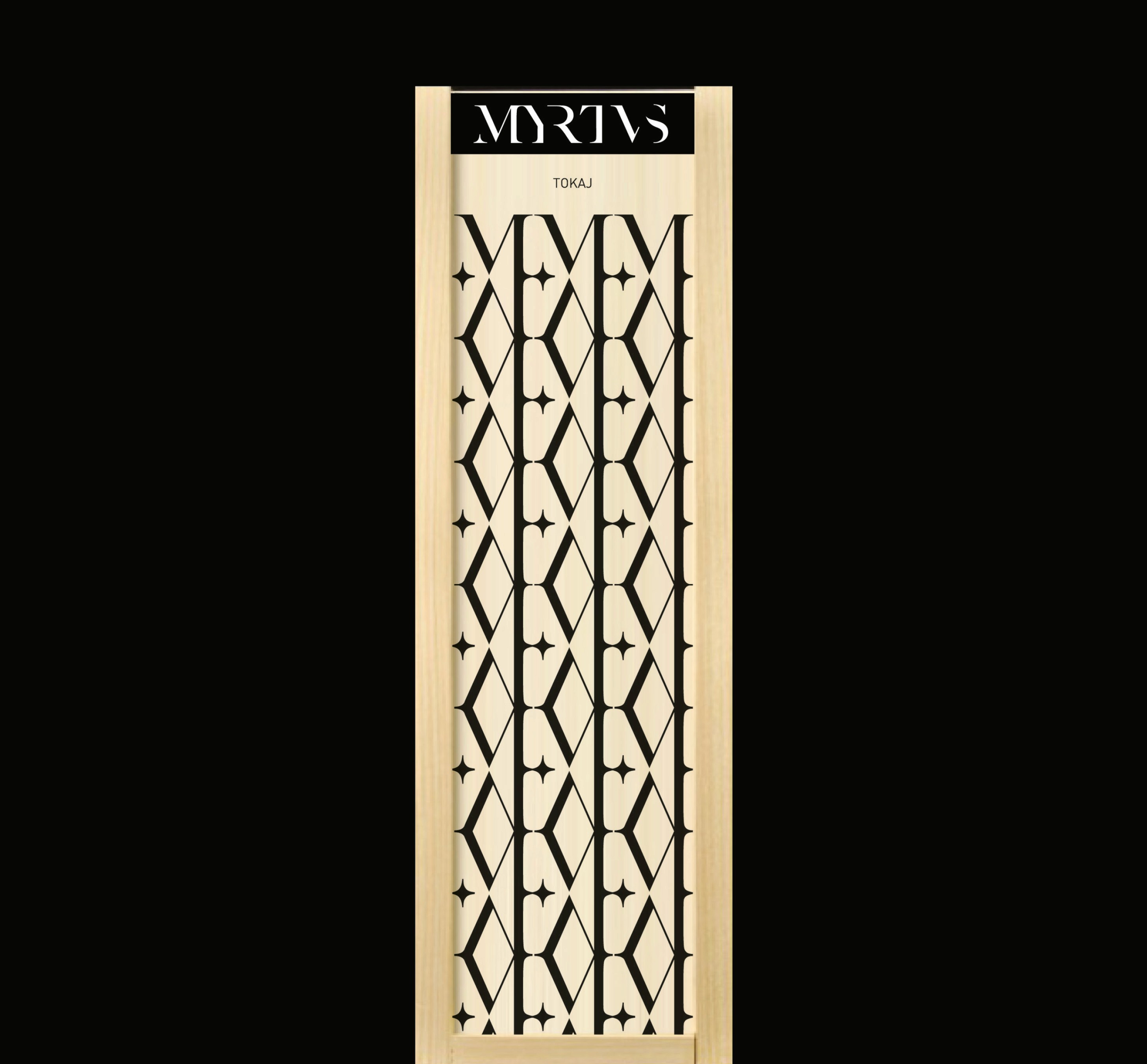
Myrtus winery
Myrtle is a native jewel of the Mediterranean coast, its history tightly interwoven with the very dawn of viticulture and winemaking. This shared cradle creates a poetic parallel between the world of wine and Myrtus. The typography of the logo pays homage to this classical legacy. Inspired by a timeless antiqua typeface (Caslon), its roots trace back to the iconic stone inscriptions of Trajan’s Column (113 AD)—the birthplace of the Latin alphabet. The anatomy of the name has been reimagined for flawless legibility and aesthetic harmony. The interwoven letterforms create a seamless, unified wordmark; they are inseparable from one another. Echoing ancient Roman monuments, the letter „U” is replaced by a classic „V”, breathing an authentic historical air into the design. The visual identity is guided by minimalism and timeless elegance. Across the portfolio, the towns of Tokaj-Hegyalja appear as stylized dots reminiscent of a celestial constellation, lending the winery a unique, unmistakable character.
Services
Logo Design, Packaging, Visual Identity
Client
Myrtus Winery
Design
Kiss Zsombor
Year
2011